Deserted Beaches and Applique Peaches: The Highlights of London Fashion Week
Article by Mia Furlong (Head Writer)
In February this year, the concept of a new type of Fashion Week was inconceivable. Despite the growing calls for changes to the infamous, bi-annual weeks taking place in London, Milan, New York and Paris, these changes seemed far-off, or perhaps impossible. In a fashion climate that has celebrated consumerism and glorified fast fashion, the steps towards sustainability, diversity and inclusivity seemed to be small and uphill. Seven months later, and the fashion landscape we inhabit has changed more rapidly and drastically than even the most optimistic fashion activist could have predicted at the start of this year. What then, did this mean for London Fashion Week, and what did it mean for its viewers?
This weekend, I took on the task of watching the entirety of London Fashion Week, in a bid to answer these questions. I can’t pretend that the lived experience of the week changed much for me – with no invite, I am well accustomed to sitting in front of a laptop, eating a copious amount of cheese and scrolling through videos and Instagram posts to find the best catwalk content. The content of this season’s LFW was, however, remarkably different. There was a renewed focus on touch, and direct gaze, replicating what has been sorely missed in the six months of zoom calls and social distancing. Many designers prioritised escapism, favouring remote beach locations and mountains. The importance of community was also noticeable – designers enlisted the help of family members and friends as models and muses, and there was a marked absence of the usual influencers and supermodels we have grown so accustomed to seeing. In a lockdown state, the news became impossible to ignore, and this too was apparent in this year’s collections: Halpern’s heroes of the front line, Osman Yousefzada’s use of BLM protest footage, and the numerous commitments to sustainability, ranging from Marques ‘ Almeida to Daniel Fletcher.
Read on for a roundup of the most noteworthy collections from this season’s London Fashion Week. You can watch every show I’ve discussed, and the ones I haven’t, here, and catch up with what our other writers thought over on our Instagram.
THURSDAY
BURBERRY
What’s more London that London Fashion Week? The answer to that, Burberry, kicked off the week. Since taking the helm of the iconic British brand, Ricardo Tisci has made vast changes, even rebranding its infamous logo. This collection, disappointingly, failed in this ground-breaking spirit. The show promised “unbridled natural instincts and focused precision, between rules and rebellion.” This oxymoronic, bold claim set the tone for the entire show. Whilst Burberry did what it does best – beautifully structured coats – incredibly well, incorporating the designs of Ann Imhof, the rest of the show seemed confused. The forest-set premise was somewhat cultish, and was at odds with the clothes on offer. Perhaps next time, the “natural instincts” of the brand should be listened to more.
TEMPERLY
Burberry was followed by Temperly’s fashion film, the first of many of the week to be filmed on the beach. The collection was evocative of the Bloomsbury group, and epitomised Alice Temperly’s commitment to a “confident, feminine and effortless attitude whilst staying true to British heritage”.
FRIDAY
HALPERN
Friday started with Halpern’s “Heroes of the Front Line”. Eschewing professional models for eight front line workers who have contributed to keeping the country afloat during the COVID-19 pandemic, the film perfectly captured the both the glamour and celebration intrinsic to the Halpern brand. The focus here switched from Christmas parties to COVID wards, and it felt apt. The clothes were beautiful and bold, and the collection showcased a feeling of joy that many of those, especially those working on the front lines, have been missing for some time.


PAUL COSTELLOE
Paul Costelloe is a brand that has typically gone under my radar, and I only knew of him as personal designer to the late princess Diana. Something about this collection, however, really struck me. It may be that giant, blown-out blonde hair, and electric blue eyeshadow, that has forever screamed “Fashion Week” to me. Regardless of this personal enthusiasm, the collection excelled. It was feminine and playful, with a delicate utilitarian edge. Most importantly, it felt wearable – with or without blue eyeshadow.
HILLIER BARTLEY
Hillier Bartley – the collaboration between Kate Hillier and Luella Bartley, injected some comic relief into the week. The short fashion film: “Keep It Together”, offers a Terminator-esque landscape where paperclips have been outlawed: “the world is falling apart”. Was this a tongue-in-cheek metaphor for the whole of 2020? Or was it just a fun marketing campaign for the divisive paperclip earring? In all honesty, I’m still undecided.
80N8
The 80N8 “Gala in the Pond!” video was in collaboration with Asics. I have long harboured the (perhaps irrational) belief that Asics trainers are designed for people who hate themselves. Whilst the video did little to sway me from this belief, as there was not a single trainer in sight, 80N8’s clothes were fun. Notable pieces include the red vinyl coat, and the pink tailored trousers. The film presents itself as a surreal showcase, scored by music not dissimilar to that of early Man Ray films, and reads as an exaggerated take on the ridiculousness of lockdown, and the ways in which we seek to overcome loneliness and monotony.

VINTRI ANDREWS
Vintri Andrews again takes us to the beach for their short film. This one held a bit of a soft spot for me, as it was filmed in Torquay, not far from my own home. The ethos of the brand also resonated: “reconstructed garments, recycled high end clothing, detailed applique, strong graphics and simple but exciting clothing sequences”. The collection captured something about being a teenager and living by the sea, but I wondered who this collection was designed for. The models looked so young, and at odds with what else was on offer at Fashion Week. Vintri Andrews are perhaps spot on in their recognition that it is the younger generation who will drive the changes towards sustainable practice and innovation in the fashion industry, particularly with the rise in the recycling and repurposing that takes place through thrifting and on platforms such as Depop. Hopefully, the brand will pave the way for an appreciation of younger generations as active consumers who are eco-conscious, and drive the change for us all to do better.
EDWARD CRUTCHLEY
The opening to Edward Crutchley’s LFW showcase boldly claims it is “a fashion film that captures the feeling of being on the front row of our show”. I cannot confirm or deny this, but the film did the clothes justice: well cut, structured pieces with bold prints. The fruit motifs that have haunted us since the first screening of Call Me By Your Name at are clearly not going anywhere, here given a luxurious upgrade for the Winter party season in heavy beaded applique. I predict this detail may be the most replicated on the high street, and expect to see budget replicas of the stunning structured gown imitated poorly on SheIn by the time this goes to print.

RIXO
A short but honourable mention for Rixo just for being an absolute delight to watch. A slightly strange choice was made in the “Hills are Alive” cover, which was also a bit at odds with the underwater inspiration. The Matisse inspiration is notable, a trend that seems to have boomed years ago and is stubbornly refusing to go away. Am I unhappy about this? Absolutely not.

ON/OFF
This was a powerful video that tapped into the opportunities for activism that a digital LFW could provide. On/Off’s video fiercely disregarded fast fashion and the wasteful mentality it fosters. The film, like many of the videos presented this Fashion Week, chose to showcase male dancers, a positive step towards dismantling toxic masculinity and its accompanying stereotypes. Whilst the film felt less about the clothes, and more about the brand’s ethos, this seemed largely in line with the brand identity itself: quite literally, substance over style, but done in a beautiful and powerful way.
SATURDAY
ROBYN LYNCH
Robyn Lynch’s “making of” fashion video was “supported and sponsored by Baldoyle Industrial Estate, Dublin 13, Since 2011”. Many of the videos of this LFW celebrated community and family, however, Lynch’s excelled. This type of video can come off as disingenuous at best, and at times, tokenistic and patronising, but Lynch’s honest celebration of community spirit in industrial Dublin was spot on. Moreover, often these videos lose artistic merit, in favour of a focus to look “DIY” or “homemade”. Lynch’s video, however, was beautiful: her designs, of sportswear and traditional Irish knitting patterns, sit comfortably against the backdrop of Baldoyle industrial estate. It is only as the camera moves that the viewer can see the construction of the fashion shoot. The soundtrack is also fantastic. This is probably my favourite collection of the entirety of LFW, and I want to be Robyn Lynch’s best friend.

MARQUES‘ALMEIDA
For LFW 2020, Marques’Almeida did not launch a new collection. Instead, they issued the publication: SEE THROUGH, Issue 1. Read as a Manifesto, M’A set out with the aim of journeying towards sustainability, which is supported by the launch of the M’A Foundation. The launch was accompanied by a dance performance by Andre Cabal. The only clothes that can be commented on here are those of worn by Cabal, which epitomised what we have come to expect from Marques’Almeida designs: bold and colourful, but also lightweight and generous in allowing the wearer to move. This is an exciting chapter for M’A, and seems like a genuine move in the right direction towards more sustainable and diverse practices.
16ARLINGTON
16Arlington again transported viewers to a seaside landscape. What has been fascinating this Fashion Week is how different designers have approached a near unanimous trend of the sea. Here, the influence is directly felt in the garments. Fishing nets took on large, exaggerated proportions across the backs of dresses which taper off into fish tails, and flowing gowns billowed and drape over the bodies of models like large waves. Bonus points for the freshwater pearl details, too.
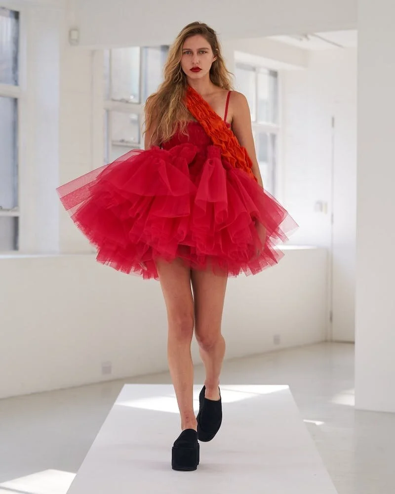
MOLLY GODDARD
What’s a London Fashion Week without Molly Goddard? What’s a Molly Goddard show without enough tulle to cover every beach location shown at this Fashion Week? It’s impossible to talk about a Molly Goddard show without talking in cliches: of course it was statuesque, picturesque, all the other.. esques? Goddard never fails to deliver a delight and this was no exception.
SUNDAY
EMILIA WICKSTEAD
The beach theme continued in the wonderful Emilia Wickstead collection. Another designer that has gone under my radar in recent years, Wickstead’s clothes seamlessly transition from fun day wear into easy evening glamour. A subtle use of colour ensures a continuing thematic feel in the collection, with very light touches of opulence provided in the draping blue silks. One exception to this is the collection’s finale of winter florals, which felt at odds to the rest of the presentation. Ignore those, and you have something special here.
PER GOTESSON FOR LILLIE
An honourable mention for Per Gotesson for bringing back the medium of the digital scrapbook, a presentation method I have loved since the days of Tavi Gevinson’s Rookie. The video – clearly a teaser – didn’t tell me much about the clothes that will be on offer, but was still thoroughly enjoyable to watch.
PALMER/HARDING
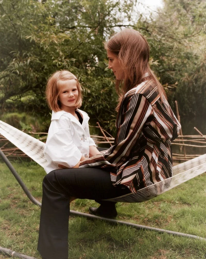
Palmer/ Harding offered “a story of our new world”, described as a “testimonial fashion film about family and love during Covid-19”. It delivered just this. It was a beautiful testament to the power of community and relationships during times of crisis, themes that many of the designers touched on during this year’s LFW. Palmer/Harding also eschewed traditional models in favour of the women in their own families, showcasing the diversity that their collections appeal to. The film was stunning, as were the clothes worn throughout it.

MONDAY
DANIEL FLETCHER
Daniel Fletcher was one of a few designers who chose to present his clothes through an interview format – here, through IGTV. Technical difficulties aside, the personal way of introducing the clothes was a nice touch – and something we have got accustomed to through Fletcher’s appearance on Next In Fashion. We know from Next in Fashion that Fletcher does menswear exceptionally well, with a focus on sustainability: his collection here exemplifies this. Fletcher explained how he is looking to reduce waste by using small panels of offcut material, which has the additional feature of making pieces unique, a technique used by many designers across LFW. The collection makes the public schoolboy charming again, which, with our current government, I thought an impossible feat. This is done through his use of traditional British heritage which favours rugby style, contrast stitch, and my personal favourite Daniel Fletcher detail – silk cummerbunds.

CHALAYAN
Disclaimer: I am not 100% sure that the Chalayan show occurred on the Monday because one joy of watching the entirety of LFW online in one go means that at some point time starts to lose all meaning and your notes get out of order. I could have skipped talking about Chalayan’s presentation to spare a confession of my disorganisation, but I couldn’t because it was just too good. The collection was titled “The Post-Colonial Body”, which Chalayan explained was “a look at how various colonial forces in the past may have affected a certain culture in a certain way, affecting how we use our bodies, and how we present ourselves”. This focus translated into a collection that celebrated movement and transformation. Shell-like dresses shrink into smaller garments, “framing the body and letting the frame collapse”. The tension between the structure and the liquidity of the collection is stunning, contrasted by what Chalayan describes as “decisive pleats”, that “monumentalise movement”. As an aesthetic exploration of postcolonialism, Chalayan delivered beautifully.
OSMAN YOUSEFZADA
In a film titled “Here to Stay”, Yousefzada presented a searing confrontation to the current state racial politics. The film is described as “more than a fashion statement”, and tackles cultural appropriation, colonial theft, and slavery. The line “I am more than Kipling’s white man’s burden” is particularly poignant. The choice of a fashion film, rather than runway presentation, not only allows for bold political statements, but also focuses the viewer’s attention to detail. Bold turquoises and lime green hues sit atop an isolate, washed out beach background, whilst bold accessories are zoomed in upon and given prominence.
TOGA
This season, TOGA have collaborated with Vivien Sassen. This collection was not my favourite; however, TOGA’s fashion film deserves a mention for showcasing the possibilities of digital fashion presentation. The use of sound was fantastic, with sounds that can only be described as onomatopoeic – “crunchy” and “drip” were hastily scrawled across my notes multiple times whilst watching this. This was combined with extreme close ups, which made the fabric seem touchable – something that I have personally really missed in the past few months. The somewhat tongue in cheek, retro collection was presented in an incredibly satisfying way, even if the clothes didn’t hit the mark.
CHRISTOPHER KANE
Christopher Kane outlined his new collection through an interview. Kane discusses his time in isolation, which involved copious amounts of glitter and many portraits of the women in his life. Kane’s video perfectly summarises the fear and anxiety so many have faced during this pandemic, and his swift turn from fashion to painting reflects the ways in which we have all adapted to cope with a rapidly changing world. The small collection is beautifully made, incorporating glitter, hand painting and digital printing on duchess satin. The simple shapes, reminiscent of the poster dresses of the 1960s, contrast beautifully with the business of the artwork that sits atop the garments.
TUESDAY
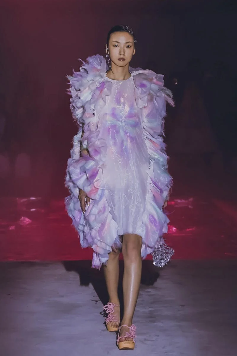
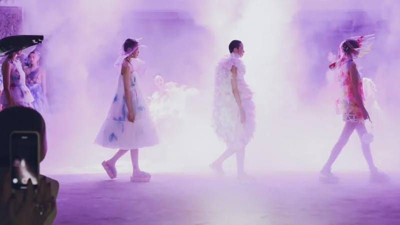
SUSAN FANG
You might have noticed the absence of Bora Aksu in this roundup, despite the rave reviews received across the board. For me, the Susan Fang collection was my Bora Aksu moment. I could not fault this collection – Fang combined the architectural shapes seen across runways this year with a delicate use of colour, which was complemented by a stunning backdrop of water mist and soft lighting. I’m forever amazed by designers like Fang, and others such as Molly Goddard, who are able to create such fantastic structures out of such delicate fabrics. Fang makes this feat seem even more monumental through translucent, ethereal colour, which gives the impression that the peaks of her dresses cross into another world. Fang’s video again uses dance as a medium through which to convey the movement of the clothes, a technique used by many of the designers over fashion week, but one that Fang excels at.
ACCIDENTAL CUTTING
Accidental Cutting was founded by Eva Istoro, fashion designer and architect, and her LFW bio notes that she holds the first PhD thesis analysing creative and experimental pattern cutting. The influence of both architecture and experimental patterns are evident in her work, with clothes that are more conceptual than wearable. The stills images show the power of these sculptural designs, however, the presentation of the fashion video, completely with large masks and biohazard-esque suits, left me rolling my eyes slightly and with a feeling that of course, someone would feel the need to present this sort of collection. Overall, it felt heavy-handed, and slightly cliché.
BIANCA SAUNDERS
Bianca Saunders’ collection celebrates her Caribbean heritage, and her sharply tailored menswear has a vibrant, playful edge to it. Saunders presents a series of personas, including “gangster pretending to be corporate”, “super-nerd at a dancehall concert” and “college grad with diploma”. Again, dance features heavily in this video, and it is particularly refreshing to see male dancing so enthusiastically celebrated this fashion week. The tailoring, like any Bianca Saunders collection, is sharp, slick and elegant, combined with prints that err on the side of flamboyant, without being garish. The premise, the clothes and the execution are all are joyful, and a delight to watch.

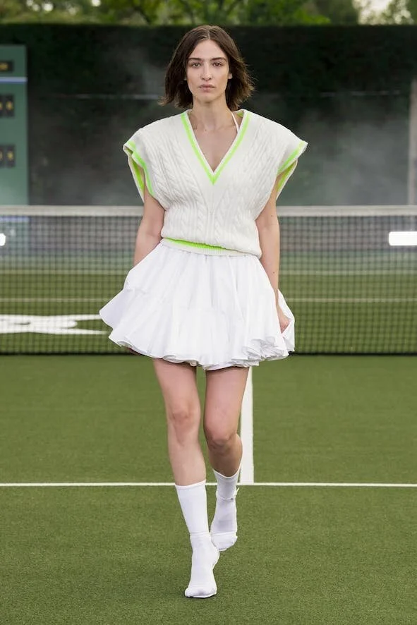
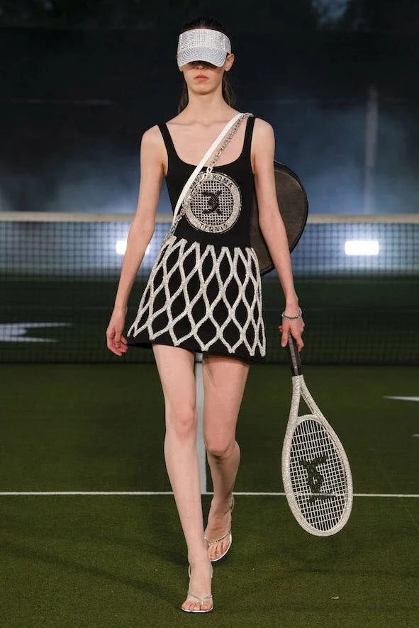
DAVID KOMA
Coming in at a close second to the Robyn Lynch and Susan Fang collections is David Koma’s. This collection made me go out and buy a sweater vest. This collection made me apologise to my flatmate for being sceptical when she purchased a sweater vest the week prior. Sweater vests have somehow become the biggest trend of LFW and it’s wonderful. The crispness of the sportswear of Koma’s collection is incredibly satisfying to watch, as he reinvents traditional sporting styles with new fabrics, embellishments, and sartorial pairings. His take on the tennis skirt, a trend that has been cropping up ubiquitously this summer, by layering multiple layers of the pleats atop each other, is particularly inspired. As are the diamante racquets, and the oversized, wide knit jumpers that evoke glittering badminton nets. This is the only way I want to play badminton, ever again.